.png)
ROLE
PROJECT TYPE
TIMELINE
Focus
Sentisocial is a digital wellbeing app designed to help users understand and take control of how they spend time on their phones.
As screen time continues to increase, many users struggle to stay aware of their usage and manage it effectively. Sentisocial addresses this by combining clear usage insights with flexible controls, allowing users to track their habits, set limits, and build more intentional digital behaviors.
Many users are unaware of how much time they spend on their phones, and even when they are aware, they often struggle to manage it effectively.
Existing tools tend to focus on tracking usage without providing meaningful ways to act on it. As a result, users are left with information but lack the flexibility and support needed to change their habits, leading to continued overuse and distraction.
This creates an opportunity to design a digital wellbeing experience that goes beyond passive tracking and actively supports behavior change.
By combining clear insights with flexible controls and supportive interactions, the product can help users not only understand their habits, but also take meaningful action to manage their screen time in a way that feels intentional and sustainable.
I partnered closely with the founder to define the product direction and translate the initial concept into a structured, user-centered experience.
I led the design end-to-end , including research, interaction design, UI, and developer handoff , shaping the product’s structure, defining key user flows, and ensuring the experience felt intuitive, flexible, and aligned with behavior change goals.
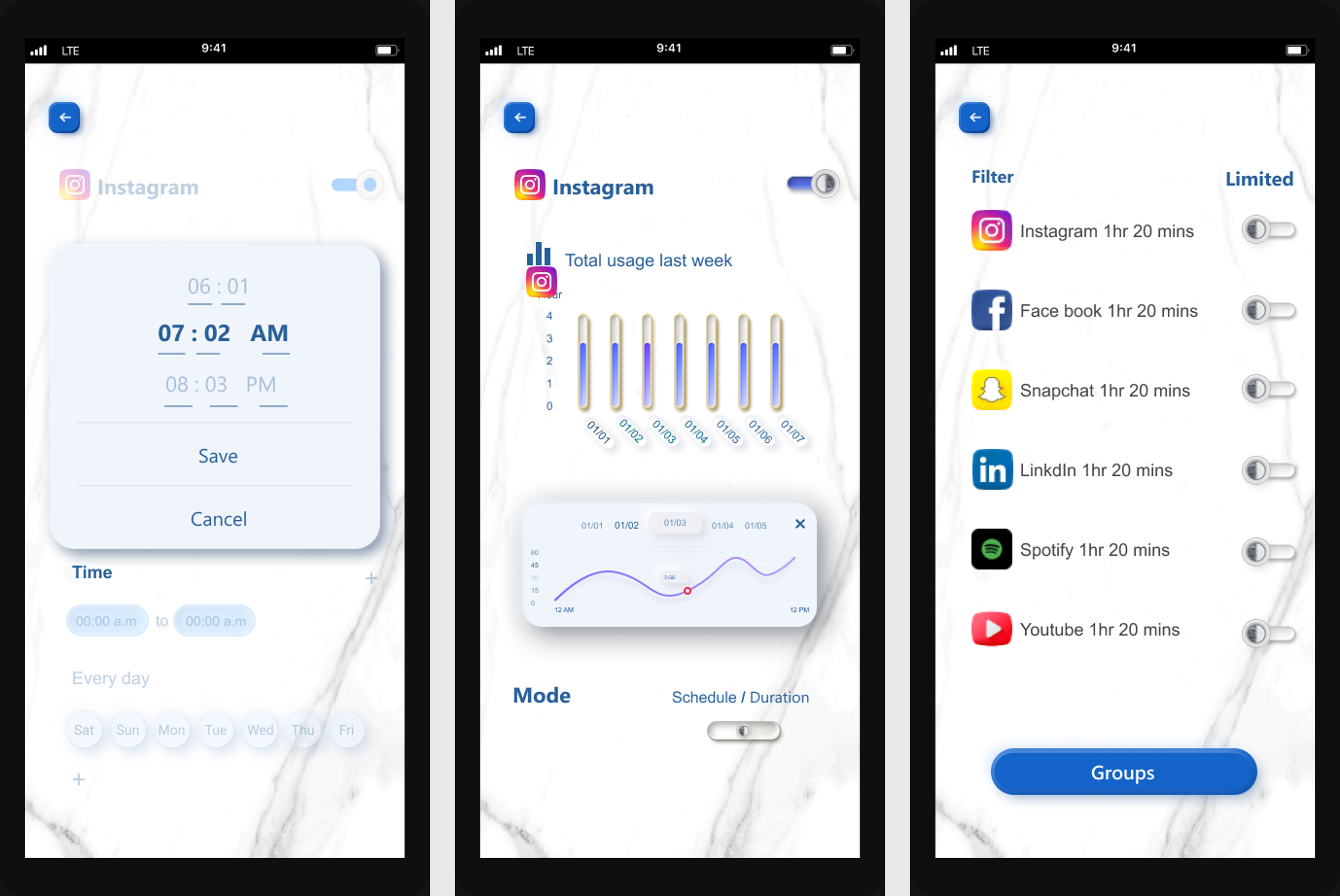
The visual direction was a collaborative effort, with certain elements, such as the marble background, inspired by the founder’s vision.
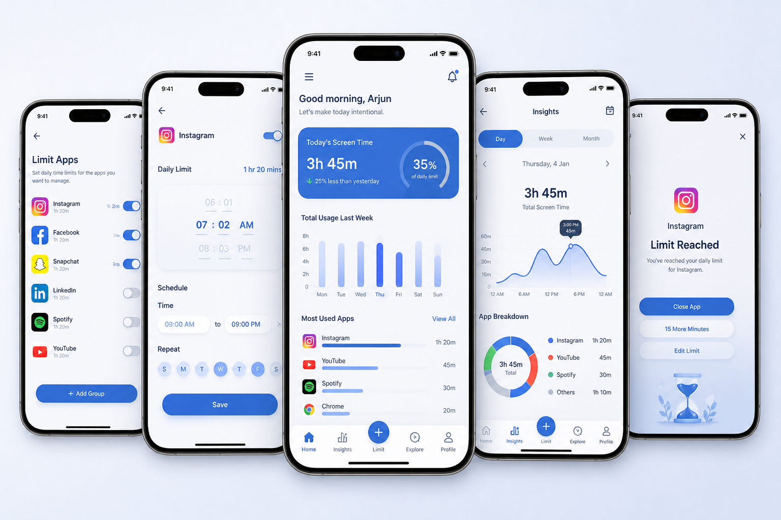
I designed Sentisocial as a mobile app that helps users understand and manage their screen time through a combination of clear insights and flexible controls.
The experience focuses on:
1. Visualizing daily and weekly app usage
2. Allowing users to set personalized time limits
3. Enabling scheduled restrictions throughout the day
4. Providing reminders and feedback to support behavior change
By connecting awareness with action, the product helps users move from simply tracking usage to actively managing their habits in a way that feels supportive and sustainable.
To ground the product in real user behavior, I explored how people currently track and manage their screen time, reviewing existing tools and gathering feedback from users about their daily habits.
At the time, there were limited solutions offering flexible control over app usage, which helped validate the opportunity to design a more user-centered approach.
I also conducted usability testing to evaluate the experience and refine key interactions based on user feedback.
Users often underestimate their screen time
Awareness alone is not enough — users need clear ways to take action
Strict limitations can feel frustrating or unsustainable
Simple, clear feedback helps users adjust behavior more effectively
These insights shaped the product direction, focusing on clarity, flexibility, and supportive interactions.
To keep the product focused and actionable, I designed the experience around three core functions:
Provide a clear overview of daily and weekly screen time across apps
Allow users to define flexible time limits for specific apps or time periods
Notify users when limits are reached and provide gentle prompts to adjust behavior
This ensured the product remained simple, usable, and directly aligned with helping users move from awareness to control.
Instead of enforcing strict restrictions, the product allows users to set personalized limits that adapt to their routines, making behavior change more sustainable.
The interface focuses on simple, easy-to-read visualizations so users can quickly understand their usage without needing to interpret complex data.
Rather than blocking access abruptly, the experience uses reminders and feedback to guide users toward healthier habits without creating frustration.
The experience is designed to help users move quickly from awareness to action with minimal friction.
View daily usage overview :
Users land on a clear dashboard showing total screen time and app breakdown
Select an app :
Tap into a specific app to see detailed usage patterns
Set a limit or schedule :
Define time limits or set usage restrictions for certain hours of the day
Receive feedback and reminders :
Get notified when limits are reached, with options to adjust or continue
This flow keeps interactions simple and focused, allowing users to understand their behavior and take action within just a few steps.
The final experience was designed to feel calm, intuitive, and supportive, helping users stay aware of their habits without adding friction or pressure.
The interface focuses on clarity and simplicity, using clean layouts and easy-to-read visualizations to make app usage immediately understandable. Key actions, such as setting limits or adjusting schedules, are designed to be quick and accessible, allowing users to take control in just a few steps.
Special attention was given to reducing cognitive load by minimizing unnecessary elements, maintaining consistent patterns, and guiding users through the experience with clear visual hierarchy.
Overall, the design balances awareness and control, creating an environment that encourages healthier digital habits while remaining flexible and non-intrusive.
To evaluate the experience, I tested key tasks including reviewing usage, setting limits, and navigating between screens.
Key findings:
1. Users quickly understood their overall screen time and app usage
2. The limit-setting flow was clear, but some controls needed better feedback
3. Navigation between screens required simplification in a few areas
The interaction design focuses on making behavior change feel simple, flexible, and supportive rather than restrictive.
This project reinforced the importance of designing for behavior change, not just functionality. Simply showing users their screen time is not enough, the experience needs to support them in taking action in a way that feels manageable and sustainable.
Working on Sentisocial helped me better understand how to balance awareness and control. Too much restriction can create frustration, while too little guidance makes it difficult for users to change their habits. Designing a system that feels supportive rather than limiting became a key focus throughout the process.
It also highlighted the value of simplicity. Reducing friction, clarifying interactions, and prioritizing essential features made the experience more effective and easier to adopt in everyday use.
If I continued developing this product, I would explore more personalized insights and adaptive recommendations to further support long-term behavior change.
Get in touch, I’d love to hear from you!
Fill out the form below and I’ll get back to you soon.

