PEZHAL
Designing a scalable E-commerce experience for a growing artisan brand
UX/UI Designer
Client Product
2 - 3 months
UX Design
Pezhal is a client project focused on helping a small handmade pottery business grow beyond Instagram-based sales. While social media provided visibility, it lacked the structure, trust, and scalability needed for a consistent shopping experience. The goal was to design a dedicated e-commerce platform that would allow customers to browse, explore, and purchase products in a more reliable and professional environment.
Existing delivery platforms often focus on food, groceries, or larger-scale logistics, leaving a gap for people who need to send small personal items quickly across the city. For urban users dealing with traffic, urgency, and busy schedules, the current experience can feel too slow, too limited, or too complicated. I wanted to explore how a local delivery product could better support these everyday moments, whether it’s sending forgotten essentials, small gifts, or time-sensitive personal items.
The client relied heavily on Instagram to showcase and sell products, but the purchasing experience was fragmented, informal, and difficult to scale. This created an opportunity to design a dedicated platform that:
1. Builds trust with customers
2. Simplifies the shopping process
3. Supports business growth beyond social media
As the designer, I worked closely with the client to define the product direction and translate business goals into a user-centered experience. I led the design end-to-end, from discovery and user research to wireframes, UI design, and usability validation, ensuring the final product aligned with both user needs and the client’s vision.
I designed Pezhal as a mobile-first e-commerce experience that enables users to browse and purchase handcrafted pottery in a seamless and trustworthy way.
The platform focuses on:
Clear product presentation
Simple browsing and navigation
Secure and reliable checkout experience
Research & Key Insights
To validate the concept, I surveyed potential users and spoke with people who regularly rely on delivery services in urban environments. I wanted to better understand both the users and the business context. I collaborated with the client to define the target audience and product goals. I conducted surveys and gathered insights about user behavior, shopping preferences, and expectations when purchasing handcrafted products online. To understand whether speed, flexibility, and trust were strong enough pain points to justify a more lightweight delivery experience.
Users discovered products through social platforms but preferred purchasing in a more secure environment
Trust and transparency were critical when buying handmade or high-value items
Clear product details and visuals helped users feel more confident in their decisions
A smooth and simple checkout experience significantly influenced purchase behavior
Defining the MVP
To keep the product focused and practical, I defined a lightweight MVP centered around the core shopping experience:
Browse products
View product details
Complete a purchase
This ensured the experience remained simple, intuitive, and aligned with the client’s immediate business needs.
Key Product Decisions
Moving beyond Instagram dependency
The platform was designed to shift purchasing away from direct messages into a structured, reliable system.
Prioritizing trust and transparency
Clear product information, visuals, and structured flows helped users feel confident when making purchases.
Designing for simplicity
The experience was intentionally kept minimal to reduce friction and support quick decision-making.
The experience was designed to guide users through a simple and intuitive journey:
-
Discover products
-
Explore product details
-
Add items to cart
-
Complete checkout
-
Track the order
-
Receive the order
Final Experience & UI Design
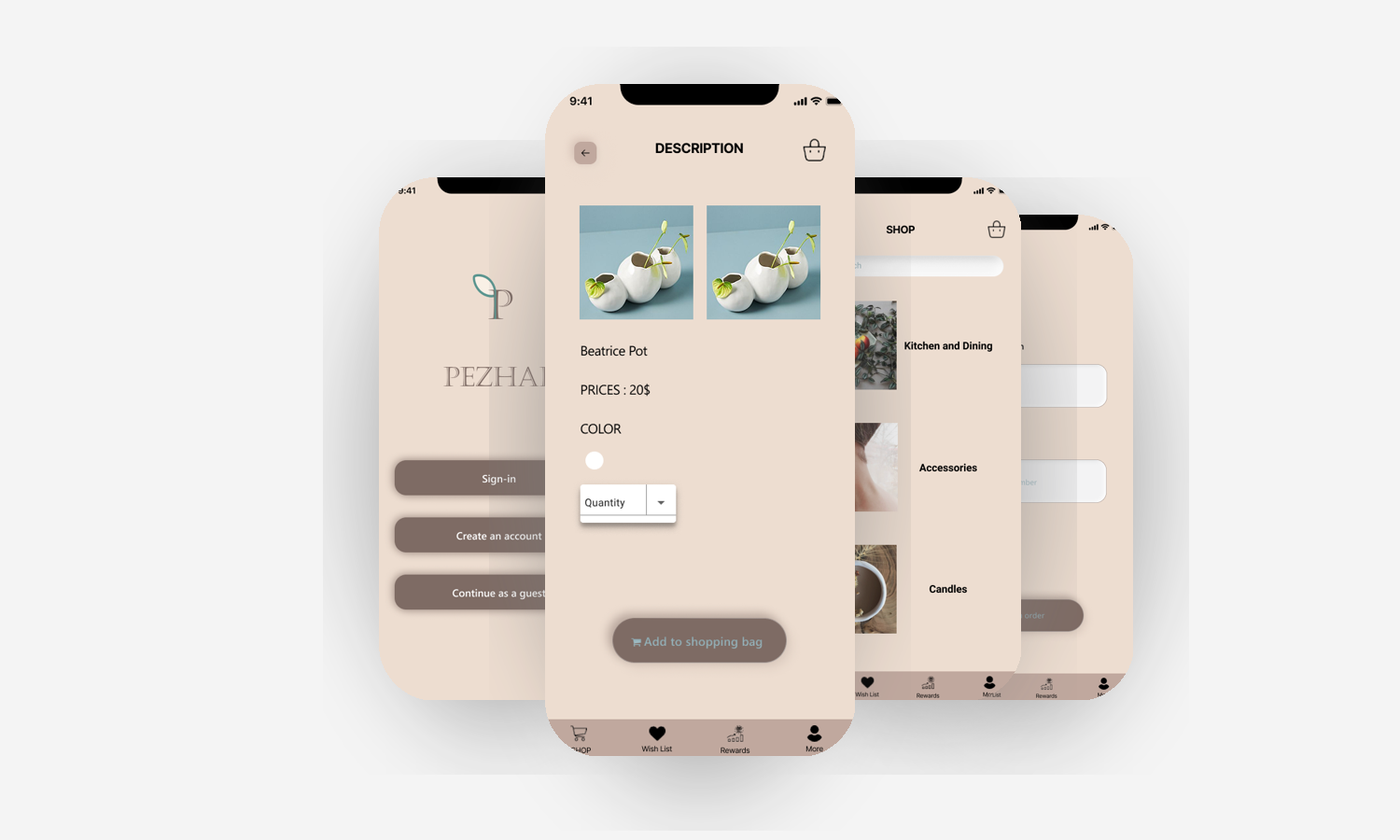
The final interface was designed to feel clean, elegant, and trustworthy. The visual design emphasizes:
1. Simplicity and clarity
2. Strong product imagery
3. A calm, refined aesthetic
4. Easy-to-scan layouts
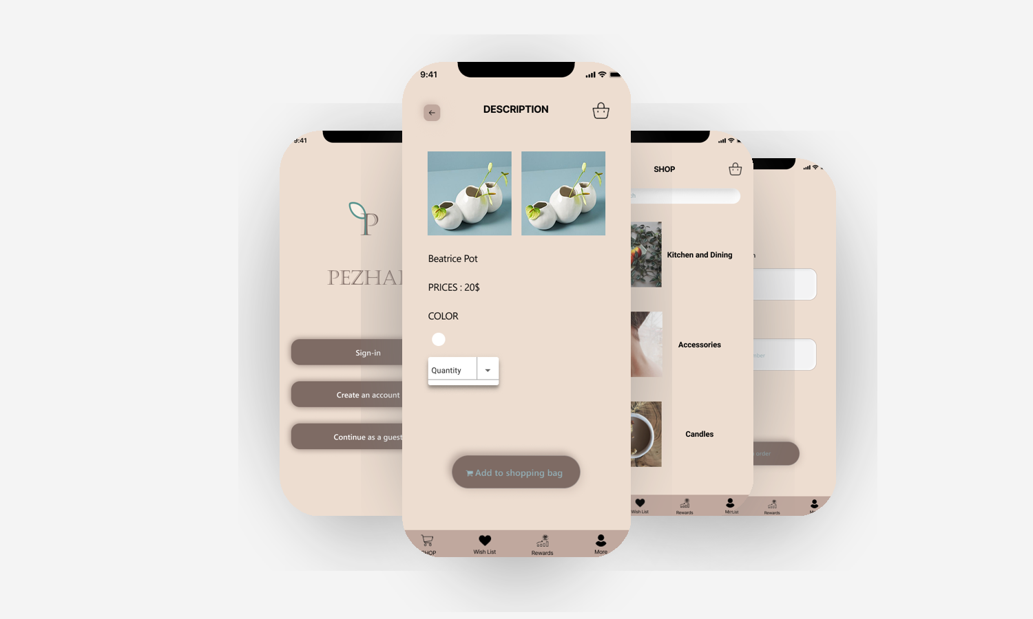
The visual direction reflects the brand’s handcrafted identity while maintaining a modern E-commerce feel, balancing warmth with clarity to support both storytelling and usability.
To evaluate the experience, I tested key tasks including:
-
Browse products
-
View product details
-
Complete a purchase
What worked
Intuitive navigation and clear product presentation.
What needed refinement
Smoother navigation and clearer checkout feedback.
Working on Pezhal reinforced that successful product design requires balancing user needs with business goals. The challenge wasn’t simply creating a better shopping experience, but designing a solution that could build trust with customers while supporting the business as it grew.
It also showed me how thoughtful design can transform an informal selling process into a structured digital experience, making it easier for customers to discover and purchase products while giving the business a more scalable foundation for the future.