MAP IT
A mobile app designed to help users navigate bus routes, track arrivals in real time, and reduce uncertainty in everyday commuting.
UX/UI Designer
Case Study
3 - 4 weeks
UI Design
Map It is a transit app designed for a midsize metropolitan area, focused on helping users plan routes, track buses in real time, and navigate their daily commutes more efficiently. The goal was to reduce uncertainty and frustration in public transportation by creating an experience that feels clear, reliable, and easy to use, especially for people who depend on transit daily.
Public transportation users often face uncertainty when planning their trips. Inconsistent schedules, long wait times, and unclear route information make commuting stressful and unreliable. Many existing solutions prioritize route data but fail to communicate real-time updates and navigation in a way that feels intuitive and trustworthy.
Public transit systems provide essential infrastructure, but their digital tools often fall short in helping users navigate real-time conditions. Riders must interpret fragmented information, making it difficult to plan efficiently or adapt to delays.
This creates an opportunity to design a transit experience centered on real-time visibility, streamlined navigation, and fast decision-making , enabling users to move through their journeys with greater confidence and less friction.
As the designer, I led the project end-to-end, from research and concept development to wireframes, UI design, and usability testing.
My focus was to create a transit experience that reduces cognitive load while helping users make faster, more confident decisions.
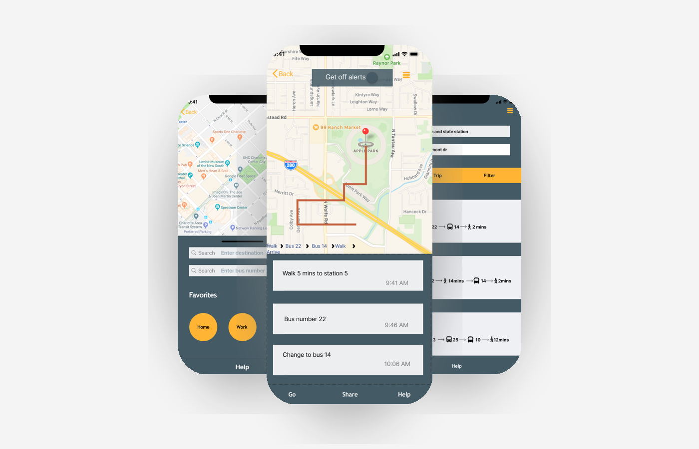
Map It is a mobile transit app designed to make commuting more predictable, efficient, and user-friendly.
The experience focuses on:
Real-time bus tracking
Simplified route planning
Clear navigation between steps
The goal was to help users move through their journey with clarity, minimizing uncertainty and wait time.
Research & Key Insights
To ground the design in real user behavior, I conducted 25 surveys and followed up with in-depth interviews with transit riders. The research revealed key pain points and patterns in how users navigate public transportation, highlighting opportunities to improve clarity, speed, and reliability in the overall experience.
respondents were under 35, indicating a predominantly younger, mobile-first audience
were students, highlighting a strong reliance on public transit for daily commuting
reported that bus timetables felt unreliable, reinforcing the need for real-time, trustworthy transit information
Use public transportation Daily
These insights confirmed that users wanted a delivery service that felt fast, reliable, and easy to use, especially for small, time-sensitive items.
Defining the MVP
To keep the experience focused, I designed the product around three key actions , which helped reduce friction and allowed users to complete their tasks quickly.
Search for a route or destination
View real-time bus details and stops
Receive alerts and track arrivals
Key Product Decisions
A lightweight request flow focused on the essential actions needed to complete a delivery.
Prioritizing real-time visibility
Instead of emphasizing static schedules, the design highlights live updates and arrival times to reduce uncertainty.
Simplifying navigation flow
The number of steps required to find a route and track a bus was minimized to reduce cognitive load.
Designing for “on-the-go” use
The interface was built for quick interactions, ensuring users could access key information in seconds while commuting.
The experience was designed to help riders find the right bus and reach their destination with minimal effort, from planning a route to arriving at their stop:
-
Search for a destination
-
Choose a route
-
View stops and trip details
-
Track the bus in real time
-
Receive trip notifications
-
Arrive at the destination
Final Experience & UI Design
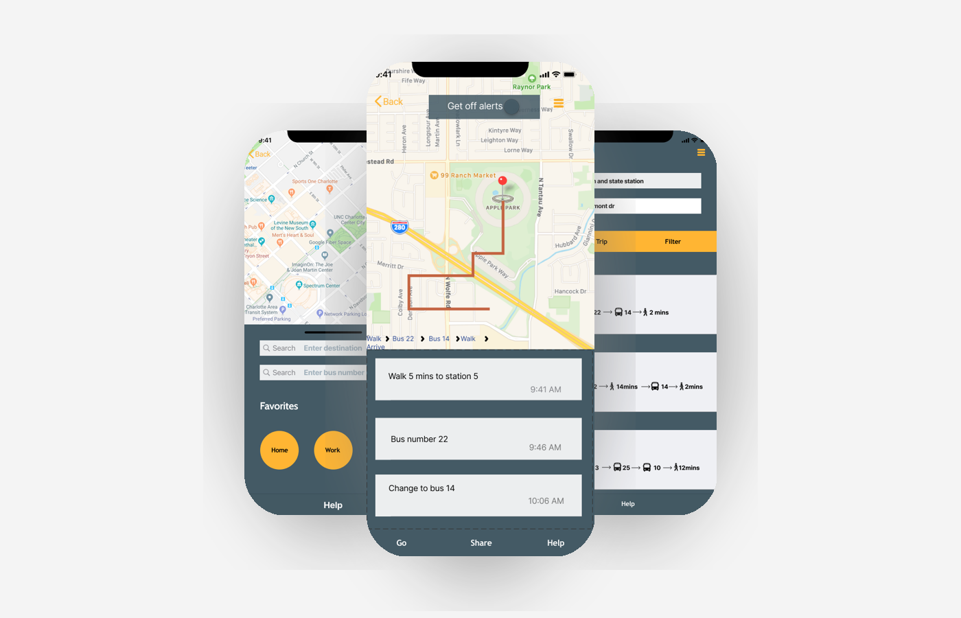
The visual design was created to feel clear, dependable, and approachable.
Color, typography, and layout were chosen to support readability and quick scanning, helping users navigate efficiently under time pressure.
To evaluate the MVP, I tested the core flow across four key tasks:
-
Searching for a route
-
Viewing bus details
-
Navigating between screens
What Worked:
1. Users found the app easy to navigate
2. The interface felt clear and approachable
This project reinforced the importance of clarity in time-sensitive experiences. When users are commuting, they don’t have time to interpret complex information, they need quick, reliable answers.
Designing Map It taught me how to reduce friction, simplify navigation, and prioritize the information that matters most in real-world situations.